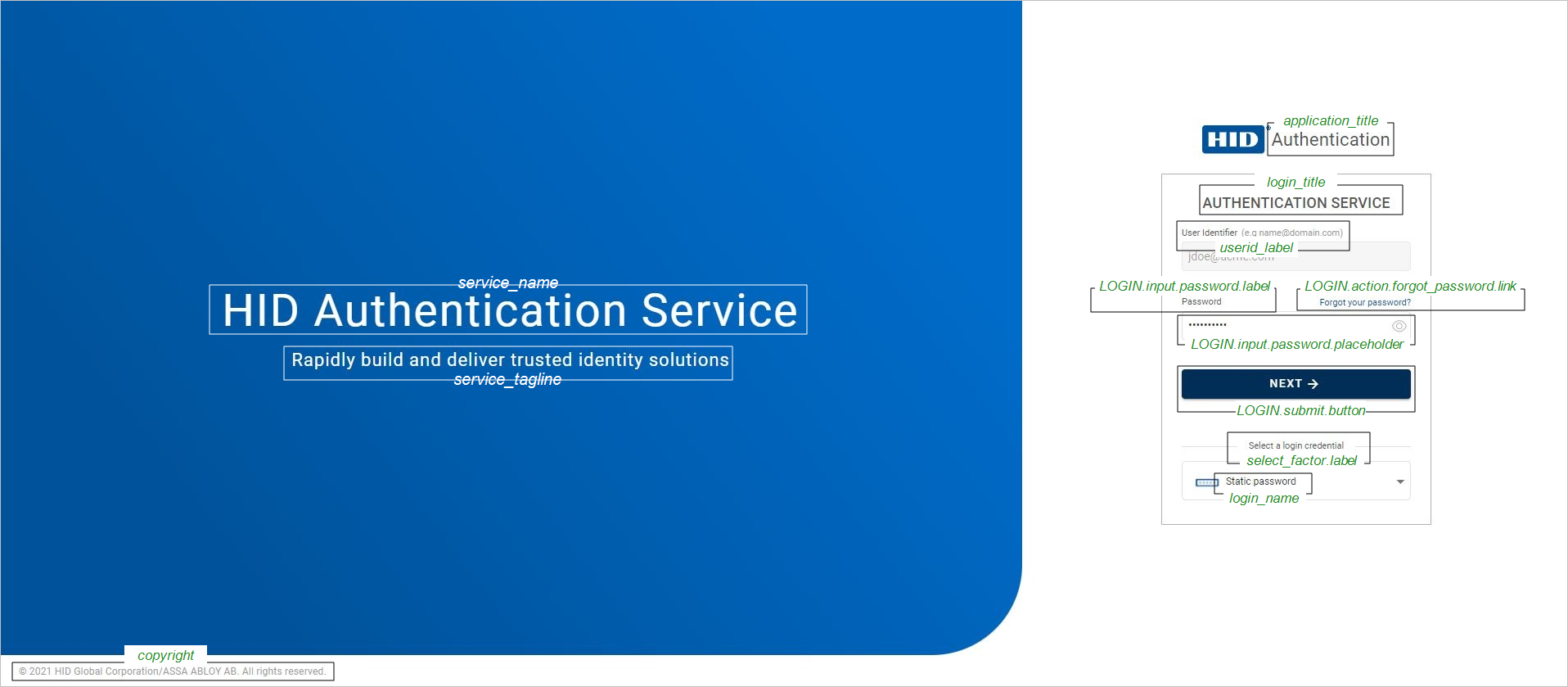
Customizing the Identity Portal
You can customize the design and labels of the IdP authentication flow using the theme configuration.
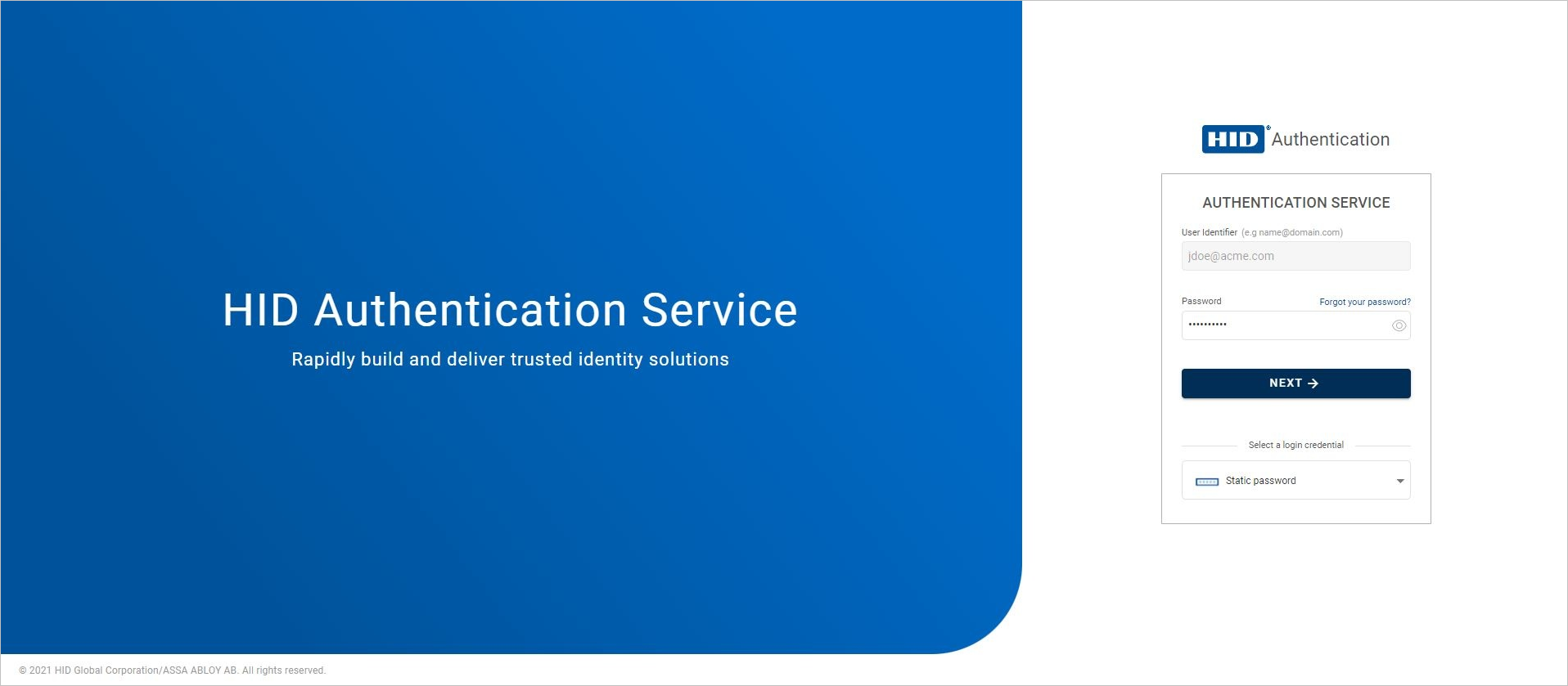
You can create and customize themes using Custo/IDPThemes endpoint.
To retrieve the payload of the default theme from which you can create a customized theme, use GET
GET https://[base-server-url]/configuration/{tenant}/v2/Custo/IDPThemes/default View a theme example
{
	"schemas": [
		"urn:hid:scim:api:idp:2.0:Customization"
	],
	"id": "ID_THEME1",
	"payload": {
		"name": "HID SSP authentication UI theme",
		"description": "HID Self Service Portal authentication UI theme configuration",
		"ui": {
			"hid_portal": {
				"login-position": "right",
				"gradient-start": "#ff0000",
				"gradient-end": "#ffaa00",
				"logo": "data:image/png;base64,iVBORw0KGgoAAAANSUhEUgAAVWZqWNWH.....<shortened>...LVjB1zBZk1nJTi/LYLKyb3YxefWSOu1b1t9HnOP+eHXbHZnV95bz0evVCtToyzZqNaY6q1UK9dy/UNmzYsGHDhg1C8D/J9batc1Yi+wAAAABJRU5ErkJggg=="
			},
			"extensions": {
				"mycustomelement1": {
					"color": "red"
				},
				"mycustomelement2": {
					"color": "orange"
				},
				"mycustomelement3": {
					"mycustomlogo1": "data:image/png;base64,iVBORw0KGgoAAAANSUhEUgAAVWZqWNWH.....<shortened>...LVjB1zBZk1nJTi/LYLKyb3YxefWSOu1b1t9HnOP+eHXbHZnV95bz0evVCtToyzZqNaY6q1UK9dy/UNmzYsGHDhg1C8D/J9batc1Yi+wAAAABJRU5ErkJggg=="
				}
			}
		},
		"localization": {
			"hid_portal": {
				"fr:": {
					"service_name": "Service d'authentification HID",
					"service_tagline": "Construisez et délivrez rapidement des solutions d'identité de confiance",
					"company_name": "HID Global",
					"application_title": "Service d'authentification",
					"next_button": "Suivant"
				},
				"en": {
					"service_name": "HID Authentication Service",
					"service_tagline": "Rapidly build and deliver trusted identity solutions",
					"company_name": "HID Global",
					"application_title": "Authentication Service",
					"next_button": "Next",
					"action.change_password.title": "Change Password",
					"action.change_password.tooltip": "Click to change password",
					"action.change_password.input.old_password.label": "Current password",
					"OTP.name": "One-Time Password",
					"OTP.tooltip": "Authenticate using an OTP generated on your token device",
					"OTP.input.otp.label": "One-Time Password",
					"OTP.input.otp.placeholder": "Enter OTP displayed on your token device"
				}
			},
			"extensions": {}
		}
	}
}
Where the theme is a JSON array with descriptions of the design parameters:
| Parameter | Description | Status |
|---|---|---|
|
id |
The unique theme identifier |
Mandatory |
|
payload |
Define how access should be filtered based on the user's existing authenticators:
|
Mandatory |
To update the template, use:
PUT https://[base-server-url]/configuration/<tenant>/v2/Custo/IDPThemes/{id}
To delete the template, use:
DELETE https://[base-server-url]/configuration/<tenant>/v2/Custo/IDPThemes/{id}
The default content is described in the following sections.
Customizing the Portal Design
The portal design contains the following variables which you can customize in the "ui" section of the theme payload:
| Container | Property Name | Value | Description |
|---|---|---|---|
|
hid_portal |
login-position |
<left|center|right> |
Position of the login dialog box. The default value is right. |
|
login-background |
<img base64 encoded> |
Image defined for the background of the login box. The default is the background image from the IdP package (assets/images/signin_bg.jpg). Note: This property is only supported when the login-position property is set to center.
|
|
|
gradient-start |
<COLOR> |
Color defined for the start of the gradient of the rounded-edge tile. The default value is the HID Global 'dark blue' color (#003087). Note: This property is only supported when the login-position property is set to left or right.
|
|
|
gradient-end |
<COLOR> |
Color defined for the end of the gradient of the rounded-edge tile. The default value is the HID Global 'lighter blue' color (#00539B). Note: This property is only supported when the login-position property is set to left or right.
|
|
|
logo |
<img base64 encoded> |
Image defined for the logo above the login box. The default image is the HID Global logo (assets/images/app-logo.png). |
|
| login-side-panel-top-left-radius | The allowed values are between 0 and 99999 pixels |
Defines the rounded top-left edge of the login page panel in pixels. The default value is 0. To disable the rounded edge effect, set the property to 0 (without 'px'). |
|
| login-side-panel-top-right-radius | The allowed values are between 0 and 99999 pixels |
Defines the rounded top-right edge of the login page panel in pixels. The default value is 0. To disable the rounded edge effect, set the property to 0 (without 'px'). |
|
| login-side-panel-bottom-left-radius |
The allowed values are between 0 and 99999 pixels |
Defines the rounded bottom-left edge of the login page panel in pixels.
To disable the rounded edge effect, set the property to 0 (without 'px'). |
|
| login-side-panel-bottom-right-radius |
The allowed values are between 0 and 99999 pixels |
Defines the rounded bottom-right edge of the login page panel in pixels.
To disable the rounded edge effect, set the property to 0 (without 'px'). |
|
|
extensions |
<custom-element-name> |
Your custom value |
Customized elements that can be referenced in the theme design You can add extensions for color definitions or images for logos |
To add a customized design in your theme configuration, set the required values for the above variables.
Example of a customized design with the login box positioned to the left using custom color extensions and logo
{
	"id": "ID_THEME1",
	"payload": {
		"ui": {
			"hid_portal": {
				"login-position": "left",
				"gradient-start": "red",
				"gradient-end": "orange",
				"logo": "data:image/png;base64,iVBORw0KGgoAAAANSUhEUgAAVWZqWNWH.....<shortened>...LVjB1zBZk1nJTiYi+wAAAABJRU5ErkJggg=="
			},
			"extensions": {
				"mycustomelement1": {
					"color": "red"
				},
				"mycustomelement2": {
					"color": "orange"
				},
				"mycustomelement3": {
					"mycustomlogo1": "data:image/png;base64,iVBORw0KGgoAAAANSUhEUgAAVWZqWNWH.....<shortened>...LVjB1zBZk1nJTi/LYLKyb3YxefWSOu1b1t9HnOP+eHXbHZnV95bz0evVCtToyzZqNaY6q1UK9dy/UNmzYsGHDhg1C8D/J9batc1Yi+wAAAABJRU5ErkJggg=="
				}
			}
		},
		"localization": {
      ...
		}
	}
}
Customizing the Labels
Labels are defined by sets of key/value pairs in the default theme configuration.
The labels vary depending on the authenticator factor type. The following example illustrates the labels for the LOGIN type elements:
Two localization files, one with the labels in English and the other in French, are bundled with the new IdP and loaded by default. The labels will be displayed in the locale detected in the user's browser or system.
-
If you want to modify labels for the English or French versions, you can customize them in the "localization" section of the payload.
-
If you want to provide labels in a different language, you can localize the full label set in the "localization" section of the payload.
Default Application Information
| Label Key | Default English Value | Default French Value |
|---|---|---|
| service_name | HID Authentication Service | HID Authentication Service |
| service_tagline | Rapidly build and deliver trusted identity solutions | Construisez et délivrez rapidement des solutions d'identité de confiance |
| copyright | HID Global Corporation/ASSA ABLOY AB. All rights reserved. | HID Global Corporation/ASSA ABLOY AB. Tous droits réservés. |
| application_title | Authentication Service | Authentication Service |
| login_title | Sign in | Connexion |
| select_factor.label | Select an authentication method | Choisissez une option d'authentification |
Default Button Labels
| Label Key | Default English Value | Default French Value |
|---|---|---|
| next_button | Next | Suivant |
| cancel_button | Cancel | Annuler |
| submit_button | Submit | Valider |
Default User ID Information Labels
| Label Key | Default English Value | Default French Value |
|---|---|---|
| userid.label | User Identifier | Identifiant |
| userid.placeholder | Enter your username | Entrez votre nom d'utilisateur |
| userid.tooltip | Enter your username | Entrez votre nom d'utilisateur |
| userid.error.required | User Identifier is required | Identifiant requis. |
Default Activation Code Authentication Labels
| Label Key | Default English Value | Default French Value |
|---|---|---|
| CODE.name | Activation code | Code d'activation |
| CODE.tooltip | Authenticate using an activation code | Authentifiez-vous avec votre code d'activation |
| CODE.input.code.label | Activation code | Code d'activation |
| CODE.input.code.placeholder | Enter your activation code | Entrez votre code d'activation |
| CODE.input.code.tooltip | Enter your activation code | Entrez votre code d'activation |
| CODE.input.error.required | Activation code is required. | Code d'activation requis. |
| CODE.input.method.label |
Select how you want to receive your OTP |
Sélectionnez comment vous souhaitez recevoir votre OTP |
| CODE.methods.email | Receive OTP by email | Recevoir OTP par courrier électronique |
| CODE.methods.sms | Receive OTP by SMS | Recevoir OTP par SMS |
| CODE.submit.button | Next | Suivant |
| CODE.error.nomethod.message | No Out Of Band method has been found to deliver the OTP. | Aucun canal hors bande trouvé pour envoyer l'OTP. |
| CODE.error.defaultmessage | Invalid Username or Activation Code. | Utilisateur ou code d'activation invalide. |
Default FIDO Authentication Labels
| Label Key | Default English Value | Default French Value |
|---|---|---|
| FIDO.name | FIDO | FIDO |
| FIDO.tooltip | Authenticate using FIDO | Authentifiez-vous en utilisant FIDO |
| FIDO.instructions | Connect your FIDO key, click Next, and follow the instructions given by your browser. | Connectez votre clef FIDO, cliquez sur Suivant, et suivez les intructions de votre navigateur. |
| FIDO.submit.button | Next | Suivant |
| FIDO.enroll_action.separator | OR | OU |
| FIDO.enroll_action.link | Enroll your FIDO device, | Enregistrez votre clé FIDO, |
| FIDO.enroll_action.tooltip | Click to enroll your FIDO device | Cliquez pour enregistrer votre clé FIDO |
| FIDO.error.not_supported | This client does not support the Web Authentication API! | Ce client ne prend pas en charge l'API Web Authentification ! |
| FIDO.error.defaultmessage | Invalid FIDO credential. | Données FIDO invalides. |
Default Contactless Card Authentication Labels
| Label Key | Default English Value | Default French Value |
|---|---|---|
| "CARD.name" | "Contactless card", | "Carte sans contact", |
| "CARD.tooltip" | "Authenticate using a contactless card", | "Authentifiez-vous avec une carte sans contact", |
| "CARD.liteClient.install" | "Please download and install the Client to use a card.", | "Veuillez télécharger et installer le Client pour utiliser une carte.", |
| "CARD.liteClient.update" | "Please download and update the Client to use a card." | "Veuillez télécharger et mettre à jour le Client pour utiliser une carte." |
| "CARD.liteClient.tooltip" | "Download Authentication Device Client", | "Télécharger Authentication Device Client.", |
| "CARD.liteClient.newVersion" | "The HID Authentication Device Client is outdated. A new version is available. Please download and install the Client." | "HID Authentication Device Client n'est pas à jour. Une nouvelle version est disponible. Veuillez télécharger et installer le Client." |
| "CARD.liteClient.downloadNow" | "DOWNLOAD NOW" | "TELECHARGER MAINTENANT" |
| "CARD.liteClient.commFailed" | "Try restarting your computer or updating HID Authentication Device Client." | "Essayez de redémarrer votre ordinateur ou de mettre à jour HID Authentication Device Client." |
| "CARD.liteClient.tooltip" | "Authentication Device Client", | "Télécharger Authentication Device Client", |
| "CARD.message.unsupported" | "Cards are only supported on Microsoft Windows computers.", | "Le support des cartes ne fonctionne que sur Windows.", |
| "CARD.message.connectReader" | "Connect a card reader.", | "Branchez un lecteur de cartes.", |
| "CARD.message.loading" | "Loading...", | "Chargement...", |
| "CARD.message.makePageActive" | "Make this page active to use your card.", | "Activez cette page pour utiliser votre carte", |
| "CARD.error.needLiteClient" | "The HID Authentication Device Client is not detected.", | "HID Authentication Device Client n'est pas détecté.", |
| CARD.error.updateLiteClient" | "The HID Authentication Device Client is outdated." | "HID Authentication Device Client n'est pas à jour." |
| "CARD.error.adcCommunicationFailed" | "Communication with Authentication Device Client failed." | "La communication avec Authentication Device Client a échoué." |
| "CARD.error.errorGeneral" | "An error has occurred.", | "Une erreur est survenue.", |
| "CARD.error.unsupported" | "Cards are not supported on this device.", | "Les cartes ne sont pas supportées avec ce lecteur.", |
| "CARD.error.unsupportedCard" | "This card is not supported.", | "Cette carte n'est pas supportée.", |
| "CARD.error.cannotReadCard" | "Cannot read the card.", | "Lecture de carte impossible.", |
| "CARD.auth.enroll_action.separator" | "OR", | "OU", |
| "CARD.auth.enroll_action.tooltip" | "Click to enroll your Contactless card", | "Cliquez pour enregistrer votre carte sans contact", |
| "CARD.auth.enroll_action.link" | "Enroll your Contactless card", | "Enregistrer votre carte sans contact", |
| "CARD.auth.message.disabled" | "Authentication with card is disabled.", | "Le support de l'authentification par carte n'est pas activé.", |
| "CARD.auth.message.instructions" | "Present your card.", | "Présentez votre carte sans contact.", |
| "CARD.auth.message.authenticating" | "Authenticating...", | "Authentification...", |
| "CARD.auth.message.authenticatedOk" | "Authentication succeeded.", | "Authentification réussie", |
| "CARD.auth.message.authenticationFailed" | "Authentication failed", | "Echec de l'authentification", |
| "CARD.enroll.title" | "Enroll your card", | "Enregistrer votre carte sans contact", |
| "CARD.enroll.tooltipNickname" | "Enter your card nickname", | "Entrez le nom de votre carte sans contact", |
| "CARD.enroll.placeholderNickname" | "Enter nickname for the card here", | "Entrez ici le nom de votre carte sans contact", |
| "CARD.enroll.tooltipBtn" | "Click to enroll your card", | "Cliquez pour enregistrer votre carte sans contact", |
| "CARD.enroll.button.submit" | "Next", | "Suivant", |
Default LDAP Authentication Labels
| Label Key | Default English Value | Default French Value |
|---|---|---|
| LDAP.name | Corporate Password | Mot de passe d'entreprise |
| LDAP.tooltip | Authenticate using your corporate password | Authentifiez-vous avec votre mot de passe d'entreprise |
| LDAP.input.password.label | Corporate Password | Mot de passe d'entreprise |
| LDAP.input.password.placeholder | Enter your corporate password | Entrez votre mot de passe d'entreprise |
| LDAP.input.password.tooltip | Enter your corporate password | Entrez votre mot de passe d'entreprise |
| LDAP.input.error.required | Password is required. | Mot de passe requis. |
| LDAP.input.error.short | Password is too short. | Mot de passe trop court. |
| LDAP.submit.button | Next | Suivant |
| LDAP.expiry.warning | Your password will expire soon. | Votre mot de passe expirera bientôt. |
| LDAP.expiry.warning.notice | You can change your password now or click Next to continue. | Vous pouvez changer votre mot de passe maintenant, ou cliquer sur Suivant pour continuer. |
| LDAP.error.defaultmessage | Invalid Username or Password. | Utilisateur ou mot de passe invalide. |
Default Static Password Authentication Labels
| Label Key | Default English Value | Default French Value |
|---|---|---|
| LOGIN.name | Static Password | Mot de passe |
| LOGIN.tooltip | Authenticate using your password | Authentifiez-vous avec votre mot de passe |
| LOGIN.input.password.label | Password | Mot de passe |
| LOGIN.input.password.placeholder | Enter your password | Entrez votre mot de passe |
| LOGIN.input.error.required | Password is required. | Mot de passe requis. |
| LOGIN.input.error.short | Password is too short. | Mot de passe trop court. |
| LOGIN.action.forgot_password.link | Forgot your password? | Mot de passe oublié ? |
| LOGIN.action.forgot_password.tooltip | Click to set a new password | Cliquez pour savoir comment réinitialiser votre mot de passe |
| LOGIN.submit.button | Next | Suivant |
| LOGIN.expiry.warning | Your password will expire soon. | Votre mot de passe expirera bientôt. |
| LOGIN.expiry.warning.notice | You can change your password now or click Next to continue. | Vous pouvez changer votre mot de passe maintenant, ou cliquer Suivant pour continuer. |
| LOGIN.action.change_password.separator | OR | OU |
| LOGIN.action.change_password.link | Change your password | Changez votre mot de passe |
| LOGIN.action.change_password.tooltip | Click to change your password | Cliquez pour changer votre mot de passe |
| LOGIN.error.defaultmessage | Invalid Username or Password. | Utilisateur ou mot de passe invalide. |
Default OOB Authentication Labels
| Label Key | Default English Value | Default French Value |
|---|---|---|
| OOB.name | Out Of Band | Hors Bande |
| OOB.tooltip | Authenticate using an OTP sent Out Of Band | Authentifiez-vous avec un OTP envoyé hors bande |
| OOB.input.oob.label |
Select how you want to receive your OTP |
Sélectionnez comment vous souhaitez recevoir votre OTP |
| OOB.methods.email | Receive OTP by email | Recevoir OTP par courrier électronique |
| OOB.methods.sms | Receive OTP by SMS | Recevoir OTP par SMS |
| OOB.submit.button | Next | Suivant |
| OOB.methods.email.otp.message.1 | We emailed you the OTP. | Nous vous avons envoyé un OTP par courriel. |
| OOB.methods.email.otp.message.2 | Check your email and enter your OTP. | Vérifiez votre courriel et cliquez sur Suivant pour entrer votre OTP. |
| OOB.methods.sms.otp.message.1 | The OTP was sent to your mobile. | L'OTP a été envoyé sur votre mobile. |
| OOB.methods.sms.otp.message.2 |
Check your mobile phone and click Next to enter your OTP. |
Vérifiez vos SMS et cliquez sur Suivant pour entrer votre OTP. |
| OOB.error.nomethod.message | No Out Of Band method has been found to deliver the OTP. | Aucun canal hors bande trouvé pour envoyer l'OTP. |
| OOB.error.defaultmessage | Invalid Username or One-Time Password. | Utilisateur ou mot de passe invalide. |
| OOB.error.failotp | Failed to send OTP. | Echec de l'envoi d'OTP. |
| OOB.input.otp.label | One-Time Password | Mot de passe à usage unique |
| OOB.input.otp.placeholder | Enter the received OTP | Entrez le jeton reçu |
| OOB.input.otp.tooltip | Enter the received OTP | Entrez le jeton reçu |
| OOB.input.otp.error.required | One-Time Password is required. | Jeton requis. |
Default OTP Authentication Labels
| Label Key | Default English Value | Default French Value |
|---|---|---|
| OTP.name | One-Time Password | Mot de passe à usage unique |
| OTP.tooltip | Authenticate using an OTP generated on your token device | S'authentifier avec un mot de passe à usage unique généré sur votre dispositif à jetons |
| OTP.input.otp.label | One-Time Password | Mot de passe à usage unique |
| OTP.input.otp.placeholder | Enter OTP displayed on your token device | Entrez le jeton affiché sur votre dispositif |
| OTP.input.otp.error.required | One-Time Password is required. | Jeton requis. |
| OTP.submit.button | Next | Suivant |
| OTP.error.defaultmessage | Invalid Username or One-Time Password. | Utilisateur ou mot de passe à usage unique invalide. |
Default PKI Authentication Labels
| Label Key | Default English Value | Default French Value |
|---|---|---|
| PKI.name | Public Key Infrastructure | Infrastructure à Clés Publiques |
| PKI.tooltip | Authenticate using PKI | Authentifiez-vous en utilisant PKI |
| PKI.instructions | Click Next to connect using a certificate. | Cliquez sur Suivant pour vous connecter en utilisant un certificat. |
| PKI.submit.button | Next | Suivant |
| PKI.error.defaultmessage | Invalid certificate. | Certificat invalide. |
| PKI.error.badconf | PKI authentication cannot work properly due to bad configuration. | L'authentification par PKI ne peut pas fonctionner correctement suite à une mauvaise configuration. |
Default Push Authentication Labels
| Label Key | Default English Value | Default French Value |
|---|---|---|
| PUSH.name | Push-based authentication | Authentification par requête |
| PUSH.tooltip | Authentication using a push logon request on your device | Authentification utilisant une requête envoyée sur votre appareil |
| PUSH.selectdevice.label | Select a device | Sélectionnez un appareil |
| PUSH.deviceitem.unnamed | Unnamed device | Appareil sans nom |
| PUSH.sendtodevice.notice | Click next to receive a push logon request on your device. | Cliquez Suivant pour recevoir une requête d'authentification sur votre appareil. |
| PUSH.submit.button | Next | Suivant |
| PUSH.confirmationsent.notice | To finalize your login, an authentication confirmation was sent to your device. | Pour confirmer votre authentification, une requête de confirmation a été envoyée sur votre appareil. |
| PUSH.approve.prompt | Please approve this operation. | Approuvez cette opération. |
| PUSH.error.defaultmessage | Push logon request failed. | Echec de l'authentification par requête. |
| PUSH.error.timeout | The approval for your authentication could not be received. Please retry. | Votre confirmation d'authentification n'a pu être reçue. Veuillez réessayer. |
Default Forgot Password Labels
| Label Key | Default English Value | Default French Value |
|---|---|---|
| FORGOT_PWD.request.title | Forgot Password? | Mot de passe oublié ? |
| FORGOT_PWD.request.tooltip | Click to receive a temporary password allowing to set a new password on next screen | Cliquez pour recevoir un mot de passe temporaire vous permettant de choisir un nouveau mot de passe à l'écran suivant |
| FORGOT_PWD.methods.label | Select how you want to receive a temporary password | Comment recevoir le mot de passe temporaire ? |
| FORGOT_PWD.methods.email | Receive by email | Recevoir par courier électronique |
| FORGOT_PWD.methods.input.email.label | Email address | Adresse Email |
| FORGOT_PWD.methods.input.email.placeholder | Enter your email address | Entrez votre adresse Email |
| FORGOT_PWD.methods.input.email.tooltip | Enter your email address | Adresse Email requise. |
| FORGOT_PWD.methods.input.email.error.required | Email is required. | Adresse Email requise. |
| FORGOT_PWD.methods.sms | Receive by SMS | Recevoir par sms |
| FORGOT_PWD.methods.input.sms.label | Mobile phone number | Numéro de téléphone |
| FORGOT_PWD.methods.input.sms.placeholder | Enter your mobile phone number | Entrez votre numéro de téléphone |
| FORGOT_PWD.methods.input.sms.tooltip | Enter your mobile phone number | Entrez votre numéro de téléphone |
| FORGOT_PWD.methods.input.sms.error.required | Phone number is required. | Numéro de téléphone requis. |
| FORGOT_PWD.methods.input.sms.error.invalid | Phone number is invalid. | Numéro de téléphone invalide. |
| FORGOT_PWD.methods.input.sms.error.too_long | Ohone number is too long. | Numéro de téléphone trop long. |
| FORGOT_PWD.methods.input.sms.error.too_short | Phone number is too short. | Numéro de téléphone trop court. |
| FORGOT_PWD.methods.input.sms.error.not_mobile | Not a mobile phone number. | Entrez un numéro de téléphone portable. |
| FORGOT_PWD.methods.email.reset.message.1 | We emailed a temporary password to | Nous avons envoyé un mot de passe temporaire à |
| FORGOT_PWD.methods.sms.reset.message.1 | The temporary password was sent to your mobile number | Le mot de passe temporaire a été envoyé sur votre mobile |
| FORGOT_PWD.error.defaultmessage | Failed to reset password. | Echec de la réinitialisation du mot de passe. |
| FORGOT_PWD.reset.title | Password Reset | Réinitialisation du mot de passe |
| FORGOT_PWD.reset.tooltip | Click to set the new password | Cliquez pour appliquer le nouveau mot de passe |
| FORGOT_PWD.input.temp_password.label | Temporary password | Mot de passe temporaire |
| FORGOT_PWD.input.temp_password.placeholder | Enter the received temporary password | Entrez le mot de passe temporaire |
| FORGOT_PWD.input.temp_password.tooltip | Enter the received temporary password |
Entrez le mot de passe temporaire reçu |
| FORGOT_PWD.input.temp_password.error.required | Temporary password is required. |
Mot de passe temporaire requis. |
| FORGOT_PWD.input.temp_password.error.short | Temporary password is too short. | Mot de passe temporaire trop court. |
| FORGOT_PWD.input.new_password.label | New password | Nouveau mot de passe |
| FORGOT_PWD.input.new_password.placeholder | Enter your new password | Entrez votre nouveau mot de passe |
| FORGOT_PWD.input.new_password.tooltip | Enter your new password | Entrez votre nouveau mot de passe |
| FORGOT_PWD.input.new_password.error.required | New password is required. | Nouveau mot de passe requis. |
| FORGOT_PWD.input.new_password.error.short | New password is too short. | Nouveau mot de passe trop court. |
| FORGOT_PWD.input.confirm_password.label | Confirm your new password | Nouveau mot de passe (confirmation) |
| FORGOT_PWD.input.confirm_password.placeholder | Enter your new password again | Entrez votre nouveau mot de passe |
| FORGOT_PWD.input.confirm_password.tooltip | Enter your new password again | Confirmez votre nouveau mot de passe |
| FORGOT_PWD.input.confirm_password.error.required | Confirm password is required. | Mot de passe requis. |
| FORGOT_PWD.input.confirm_password.error.nomatch | Passwords do not match. | Mots de passe non identiques. |
| FORGOT_PWD.success.message | Password is reset. | Le mot de passe est modifié. |
Default Change Password Labels
| Label Key | Default English Value | Default French Value |
|---|---|---|
| CHANGE_PWD.title | Change Password | Changer le mot de passe |
| CHANGE_PWD.tooltip | Click to change password | Cliquez pour changer le mot de passe |
| CHANGE_PWD.input.old_password.label | Current password | Mot de passe |
| CHANGE_PWD.input.old_password.placeholder | Enter your current password | Entrez votre mot de passe actuel |
| CHANGE_PWD.input.old_password.error.required | Password is required. | Mot de passe requis. |
| CHANGE_PWD.input.old_password.error.short | Current password is too short. | Mot de passe trop court. |
| CHANGE_PWD.input.new_password.label | New password | Nouveau mot de passe |
| CHANGE_PWD.input.new_password.placeholder | Enter your new password | Entrez votre nouveau mot de passe |
| CHANGE_PWD.input.new_password.error.required | New password is required. | Mot de passe requis. |
| CHANGE_PWD.input.new_password.error.short | New password is too short. | Mot de passe trop court. |
| CHANGE_PWD.input.confirm_password.label | Confirm your new password | Confirmez votre nouveau mot de passe |
| CHANGE_PWD.input.confirm_password.placeholder | Enter your new password | Entrez votre nouveau mot de passe |
| CHANGE_PWD.input.confirm_password.error.required | Confirm password is required. | Mot de passe requis. |
| CHANGE_PWD.input.confirm_password.error.nomatch | Passwords do not match. | Mots de passe non identiques. |
| CHANGE_PWD.error.defaultmessage | Failed to change password. | Echec du changement de mot de passe. |
| CHANGE_PWD.success.message | Password is changed. | Le mot de passe est modifié. |
Default FIDO Enrollment Messages
| Label Key | Default English Value | Default French Value |
|---|---|---|
| ENROLL_FIDO.title | Enroll your FIDO device | Enregistrez votre clé FIDO |
| ENROLL_FIDO.instructions | Connect your FIDO key, click Next, and follow the instructions given by your browser. | Connectez votre clé FIDO, cliquez sur Suivant, et suivez les instructions données par votre navigateur. |
| ENROLL_FIDO.tooltip | Click to enroll your FIDO device | Cliquez pour enregistrer votre dispositif FIDO |
| ENROLL_FIDO.submit.button | Next | Suivant |
| ENROLL_FIDO.success.message | Your FIDO device has been successfully registered. | Votre clé FIDO a été enregistrée avec succès. |
| ENROLL_FIDO.error.not_supported | This client does not support the Web Authentication API! | Ce client ne prend pas en charge l'API Web Authentification ! |
| ENROLL_FIDO.error.register | Failed to register your FIDO device! | Echec de l'enregistrement de votre clé FIDO ! |
Default Contactless Card Enrollment Messages
| Label Key | Default English Value | Default French Value |
|---|---|---|
| "CARD.enroll.message.instructions" | "Present your card.", | "Présentez votre carte sans contact.", |
| "CARD.enroll.message.submitIt" | "Click Next to enroll this card.", | "Cliquez sur Suivant pour enregistrer cette carte.", |
| "CARD.enroll.message.enrolling" | "Enrolling...", | "Enregistrement...", |
| "CARD.enroll.message.enrolledOK" | "Your card has been successfully enrolled.", | "Votre carte a été enregistrée avec succès.", |
| "CARD.enroll.message.disabled" | "Card enrollment is disabled.", | "L'enregistrement de carte n'est pas activé.", |
| "CARD.enroll.error.enrollFailed" | "Failed to register your card!", | "Echec de l'enregistrement de votre carte!", |
Default Password Constraint Labels
| Label Key | Default English Value | Default French Value |
|---|---|---|
| pwd_constraints.minLength | Minimum length | Longueur minimale |
| pwd_constraints.maxLength | Maximum length | Longueur maximale |
| pwd_constraints.minDiffChars | Minimum number of different characters | Nombre minimal de caractères différents |
| pwd_constraints.onlyNum | Only numbers | Seulement des chiffres |
| pwd_constraints.onlyAlpha | Only letters | Seulement des lettres |
| pwd_constraints.numOrAlpha | Numbers OR letters | Des chiffres OU des lettres |
| pwd_constraints.numAndAlpha | Numbers AND letters | Des chiffres ET des lettres |
| pwd_constraints.atLeastOneNum | At least one number | Au moins un chiffre |
| pwd_constraints.atLeastOneLow | At least one lowercase character | Au moins une minuscule |
| pwd_constraints.atLeastOneUp | At least one uppercase character | Au moins une majuscule |
| pwd_constraints.atLeastOneSpecial | At least one special character | Au moins un caractère spécial |
| pwd_constraints.notSequence | Cannot contain sequences | Ne peut pas contenir de séquences |
| pwd_constraints.notOldPassword | Cannot be a previous password | Différent des mots de passe précédents |
| pwd_constraints.notBlackListed | Cannot be a blacklisted word | Ne peut pas être un mot interdit |
| pwd_constraints.notUserAttribute | Cannot contain a user attribute | Ne peut pas contenir un attribut utilisateur |
Default Redirect Message
| Label Key | Default English Value | Default French Value |
|---|---|---|
| redirect.message | You will be securely redirected to your service provider. | Vous allez être redirigé de manière sécurisée vers votre application. |
Default Login Error Messages
| Label Key | Default English Value | Default French Value |
|---|---|---|
| login.error.emptyfactor | No authentication option available. | Aucune option d'authentification disponible. |
| login.error.invalidurl | Invalid access request. | Requête d'accès invalide. |
| login.error.maxretry | Maximum retries reached. | Nombre d'essais maximal atteint. |
| login.error.maxfailure | You are blocked due to too many unsuccessful authentications. | Vous êtes bloqué suite à trop d'authentifications infructueuses. |
| login.error.unexpected | Unexpected error! | Erreur inattendue ! |
| login.error.unsupportedconfiguration | Unsupported configuration. | Configuration non supportée. |
| login.error.badconfiguration | Unable to proceed. Please contact your administrator. | Impossible de procéder. Veuillez contacter votre administrateur. |
| login.error.password.expired.title | Password expired! | Mot de passe expiré! |
| login.error.password.expired.message | Your password must be changed. | Votre mot de passe doit être changé. |
Default Copy Warning
| Label Key | Default Value | Default French Value |
|---|---|---|
|
copycut.warning |
The copy and cut actions are not allowed from this field. |
Les actions copier / couper ne sont pas autorisées à partir de ce champ. |
Default Notification Messages
| Label Key | Default Value | Default French Value |
|---|---|---|
| notification.success | Success! | Succes! |
| notification.warning | Warning! | Avertissement ! |
| notification.error | Error! | Erreur! |
Create Customized Labels
You can customize the values for the existing labels by modifying the definitions in the payload.
You can also add customized labels by defining the new key/value pairs for a specific authentication method or action in the theme configuration.
For example, to add the following customer-specific labels for the static password authentication method:
-
LOGIN.name.customer
-
LOGIN.tooltip.customer
-
LOGIN.input.customer_password.label
-
LOGIN.input.customer_password.placeholder
-
In your theme configuration, add the new labels in the "localization" section:
Copy{ "schemas": [ "urn:hid:scim:api:idp:2.0:Theme:AuthPortal" ], "id": "ID_THEME1", "payload": { "ui": { ... }, "localization": { "hid_portal": { "en": { "LOGIN.name.customer": "Static Customer Password", "LOGIN.tooltip.customer": "Authenticate using your customer password", "LOGIN.input.customer_password.label": "Customer Password", "LOGIN.input.customer_password.placeholder": "Enter your customer password" } }, "extensions": {} } } }Note: You only need to modify the labels that you want to customize. You do not need to update the entire set of labels. -
Then, in the authentication flow configuration, map the interface design to these new labels in the localizationKeyRedefinition property for the required authentication method or action.
The left part is the default key ("LOGIN.name"):The right part is the customized key ("LOGIN.name.customer").
Copy{ "schemas": [ "urn:hid:scim:api:idp:2.0:Customization" ], "id": "ID_CONFIG_PUSH", "payload": { "firstFactors": [ { "acr": "1", "code": "AT_CUSTPW", "factorId": "factor.user_pasword", "accessCriteriaId": "access_criteria.common_to_all", "type": "LOGIN", "actions": [ "action.change_password", "action.request_reset_password" ], "retry": 3, "localizationKeyRedefinition": { "LOGIN.name": "LOGIN.name.customer", "LOGIN.tooltip": "LOGIN.tooltip.customer", "LOGIN.input.password.label": "LOGIN.input.customer_password.label", "LOGIN.input.password.placeholder": "LOGIN.input.customer_password.placeholder" } }, { "acr": "2", "code": "AT_CUSTOTP", "factorId": "factor.otp_token", "accessCriteriaId": "access_criteria.common_to_all", "type": "OTP" } ] } }
Example of customized labels for an action
"localizationKeyRedefinition": {
            "CHANGE_PWD.title": "CHANGE_PWD.customer_title",
            "CHANGE_PWD.tooltip": "CHANGE_PWD.customer_tooltip"
        }
Localize the Labels
You can provide the labels in a new language (other than the default English and French) by translating the entire set of labels.
In your theme configuration, add a section for the locale corresponding to the required language with the translated labels in the "localization" section:
Example to add localized theme content in German
"localization": {
      "hid_portal": {
        "en": {
          "service_name": "HID Authentication Service",
          "service_tagline": "Rapidly build and deliver trusted identity solutions",
          "company_name": "HID Global",
          "application_title": "Authentication Service",
          "select_factor.label": "Select a login credential",
         },
        "fr:": {
          "service_name": "Service d'authentification HID",
          "service_tagline": "Construisez et délivrez rapidement des solutions d'identité de confiance",
          "company_name": "HID Global",
          "application_title": "Service d'authentification"
          "next_button": "Suivant"
        },
        "de": {
          "service_name": "HID Authentication Service",
          "service_tagline": "Erstellen und liefern Sie schnell vertrauenswürdige Identitätslösungen",
          "company_name": "HID Global",
          "application_title": "Authentifizierungsdienst",
          "select_factor.label": "Wählen Sie eine Anmeldeinformation aus",
          .....
         },
        .....
  	}
Customizing the Consent Display
You can customize the display of the consent prompt presented to the user when required by the application.
The customized consent values defined in the IdP theme will override the scope definition in the client adapter.
You cannot localize the scope definition in the client adapter configuration.
For the description displayed in the consent prompt, the IdP will look for CONSENT.<scope>.description in the theme "localization" entries.
-
If it finds a corresponding localized message, the message will be displayed in the consent prompt.
-
If not, the value from "description" field in the scope definition will be displayed.
For example (for a scope called 'profile'):
"CONSENT.profile.description": "User profile information:\n\temail address\n\tphone number"
You can also customize the labels used in the consent dialog box by adding the default labels to the theme:
| Label Key | Default English Value | Default French Value |
|---|---|---|
| CONSENT.title | Confirm | Confirmez |
| CONSENT.prompt | Please confirm that you agree to share the following content with: | Acceptez-vous de partager le contenu suivant avec: |
| CONSENT.datalist.label | Data requested: | Données requises: |
| CONSENT.deny.button | Deny | Refuser |
| CONSENT.confirm.button | Accept | Accepter |
"localization": {
      "hid_portal": {
        "en": {
          "CONSENT.title": "Confirm",
          "CONSENT.prompt": "Please confirm that you agree to share the following content with:",
          "CONSENT.datalist.label": "Data requested:",
          "CONSENT.deny.button": "Deny",
          "CONSENT.confirm.button": "Accept",
         },
        "fr:": {
          "CONSENT.title": "Confirmez",
          "CONSENT.prompt": "Acceptez-vous de partager le contenu suivant avec :",
          "CONSENT.datalist.label": "Données requises :",
          "CONSENT.deny.button": "Refuser"
          "CONSENT.confirm.button": "Accepter"
        },
        .....
      }


