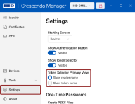
Settings
This section allows you to configure some basic settings of Crescendo Manager, including its appearance.
Appearance
Theme Mode
You can switch between the light and dark modes or the system mode, which will match the theme of your operating system.
The system mode is set as default.
Navigation Pane Mode
This setting controls the behavior of the navigation pane. You can choose from the following options:
-
Auto: The navigation pane automatically adjusts between Compact and Open modes, depending on the window size.
-
Compact: Only the icons of the navigation pane items are displayed.
-
Minimal: Navigation pane items are not displayed. You can access these items by clicking the hamburger menu icon in the top-left corner of the application window.
-
Open: Navigation pane items are displayed with both icons and their names.
-
Top: Navigation pane items are arranged as a toolbar at the top of the window, just under the title bar.
Logging
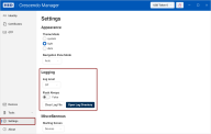
In this section, you can turn logging on or off and adjust the level of logged events.
From this dialog, you can also easily open the log directory or clear the log file.
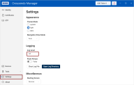
Log Level
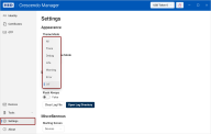
Select the level of logged events, ranging from Off to All.
From the Trace level and above, Personally Identifiable Information (PII) and other sensitive data may be recorded in the log file.
Flush Always
False: When set to False, events are logged in batches.
True: When set to True, each event is logged individually. This is particularly useful when recording errors or collecting logs from an app crash, as the last entries might otherwise be missing.
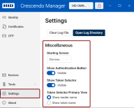
Miscellaneous
Starting screen
You can set a default starting screen to optimize your workflow.
Choose from the following options:
If a connected device doesn't support the selected default screen, Crescendo Manager will default to the Devices screen.
Show Authentication Button
The authentication button visibility toggle controls whether the authentication button in the form of an open  or locked
  padlock on the right in the title bar is visible. This button indicates the user's authentication status with the device.
Show Token Selector
The Token Selector visibility toggle controls whether the Token Selector on the right in the title bar is visible.
Token Selector Primary View
Here, you can select if the Token Selector shall display the selected token or the selected reader.
One-Time Passwords
This section allows you to:
-
Choose whether the Create PSKC Files Files used to securely transport and provision symmetric keys to cryptographic devices or software, following the Portable Symmetric Key Container (PSKC) format. toggle in the One-Time Password Configuration dialog will be set to True or False
-
Change the pre-defined PSKC Portable Symmetric Key Container. An extensible markup language (XML) format defined by the OASIS standard that is used for transporting and provisioning symmetric keys to different types of devices. transport key
-
Access or change the directory where generated PSKC files Files used to securely transport and provision symmetric keys to cryptographic devices or software, following the Portable Symmetric Key Container (PSKC) format. will automatically be saved.


